Client Case Study
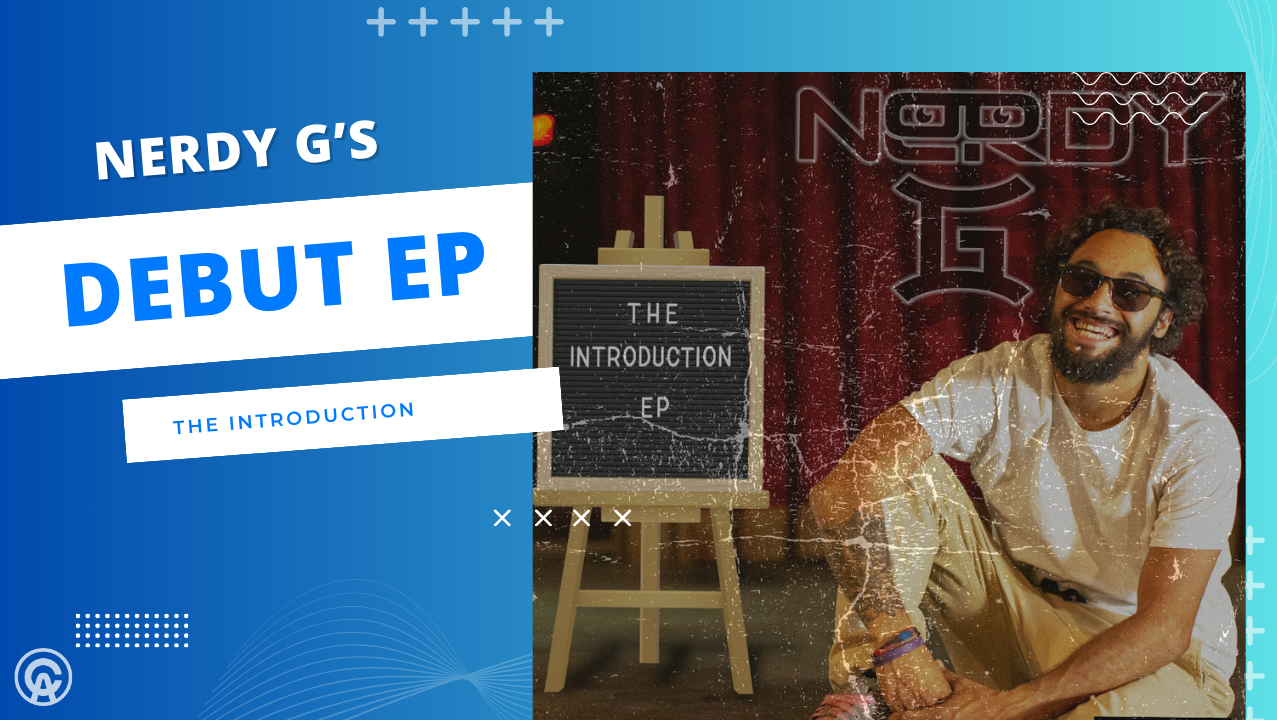
Behind The Logo: Nerdy G
The logo for Nerdy G, short for Nerdy Gemini, is a visual beat that mirrors his persona and artistry. It’s a harmonious blend of his nerdy charisma and the soulful depth of his conscious hip-hop roots. From Connecticut, Nerdy G stands out in the rap scene not only for his clever lyrics and smooth flows but also for his love of video games, sports, and family—a trifecta of passions that keep him grounded and real.
The logo’s design reflects Nerdy G’s multifaceted identity. The silhouette is sharp and defined, suggesting a clear and articulate lyrical style, while the vibrant blend of colors captures his playful side and geeky charm. The choice of purple speaks to his creativity and individuality—traits that are at the core of both his music and gamer lifestyle.
The wordmark itself is bold and impactful, just like Nerdy G’s presence on the mic and in the studio. It encapsulates his approach to hip-hop—a genre he respects and rejuvenates with his fresh takes and introspective themes. The logo is a badge of authenticity for a rapper whose verses are as much about spitting bars as they are about sparking conversations.
For those discovering Nerdy G for the first time, the logo is an invitation to dive into the beats and rhymes of a rapper who brings intellect and introspection back to the forefront of hip-hop. It’s a symbol of his commitment to craft, community, and the pure joy of the game—both in the studio and on the screen.
